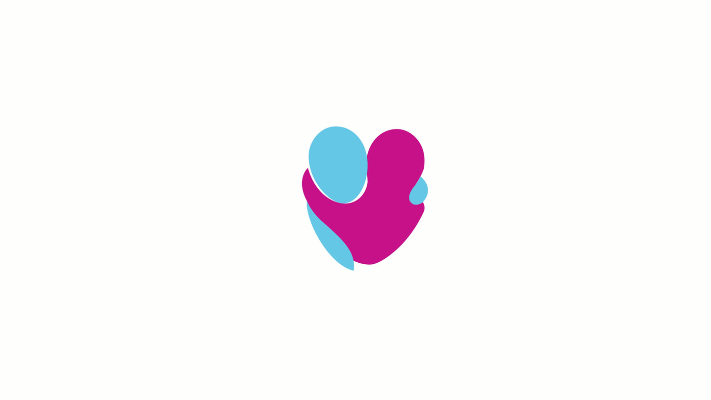
Nottingham Hospitals Charity
A clearer, stronger brand for a vital voice in local healthcare
A clear, compassionate identity that unifies sub-brands and strengthens trust across healthcare.

Project overview
Nottingham Hospitals Charity supports patients, families, and NHS staff by funding vital equipment, research, and wellbeing projects. While their mission is clear, their brand had fallen behind – with outdated guidelines, fragmented sub-brands, and inconsistent messaging.
With a new Marketing Manager onboard, the charity saw an opportunity to refresh how it presents itself – unifying its voice, updating its look, and building a brand system that could better reflect its impact and values.
The challenge
In a crowded healthcare charity sector, trust and clarity are everything. But Nottingham Hospitals Charity faced several branding issues:
Outdated identity – Existing materials were no longer fit for purpose
Fragmented sub-brands – Campaigns and appeals lacked consistency
Inconsistent tone – Communications didn’t reflect the charity’s true character
Lack of tools – Staff struggled without clear templates or guidelines
They needed a refreshed brand that could bring everything together, speak with one voice, and make it easier for the team to communicate confidently.
Our approach
We started with on-site workshops, speaking to staff, stakeholders, and supporters. From these insights, we built a strategy focused on evolution – not reinvention.
What we delivered
Refined logo and updated colour palette – Modernised for digital and print
Clear brand architecture – Connecting sub-brands under a single, unified system
New tone of voice – Compassionate, credible and confident, just like the team
Templates and tools – PowerPoint, social media, and comms assets ready to use
Brand guidelines – Practical, accessible, and built for everyday application
The result
The refreshed brand has brought clarity, confidence, and connection – inside and out.
Tangible impact
Unified identity – Events and appeals now feel like part of one family
Increased efficiency – Staff spend less time redesigning and more time fundraising
Stronger voice – Messaging now reflects the charity’s values and ambition
Improved engagement – From event signage to digital ads, the brand is cutting through
Supporters describe the new look as professional, trustworthy and warm. Public-facing campaigns – from bus ads to social media – are drawing more attention. Website visits and online donations have gone up, and team feedback highlights stronger internal alignment and pride.
What we did
Brand narrative
Key messaging


We were looking for an agency to carry out a brand refresh, and, after extensive research, we found Threerooms. From our very first conversation, they understood us, our challenges, and what we wanted to achieve. They took the time to really get to know our charity, not just delivering a project, but helping us bring the brand refresh to life.
The feedback has been outstanding. This refresh needed to resonate both externally and internally, and Threerooms guided us in creating the tools to make that happen. Rather than adding unnecessary design or complexity, they helped us simplify, go back to basics, and inject a fresh energy into our brand.
They worked within the brief, ensuring we didn’t completely transform our identity, while modernising it enough to bring us confidently into 2025. Now, we have a strong, cohesive brand that positions our charity for the next level, with maximum visibility and impact.
Laura Peberday
Head of Marketing and Communications
Nottingham Hospitals Charity
Final word
Nottingham Hospitals Charity now has a brand that works as hard as they do – one that’s consistent, compassionate, and ready to grow with them. It’s a clearer expression of who they are, what they do, and why it matters.
5-Star rated. Award-winning work.
Partner with an agency that's committed to great work and impact.


